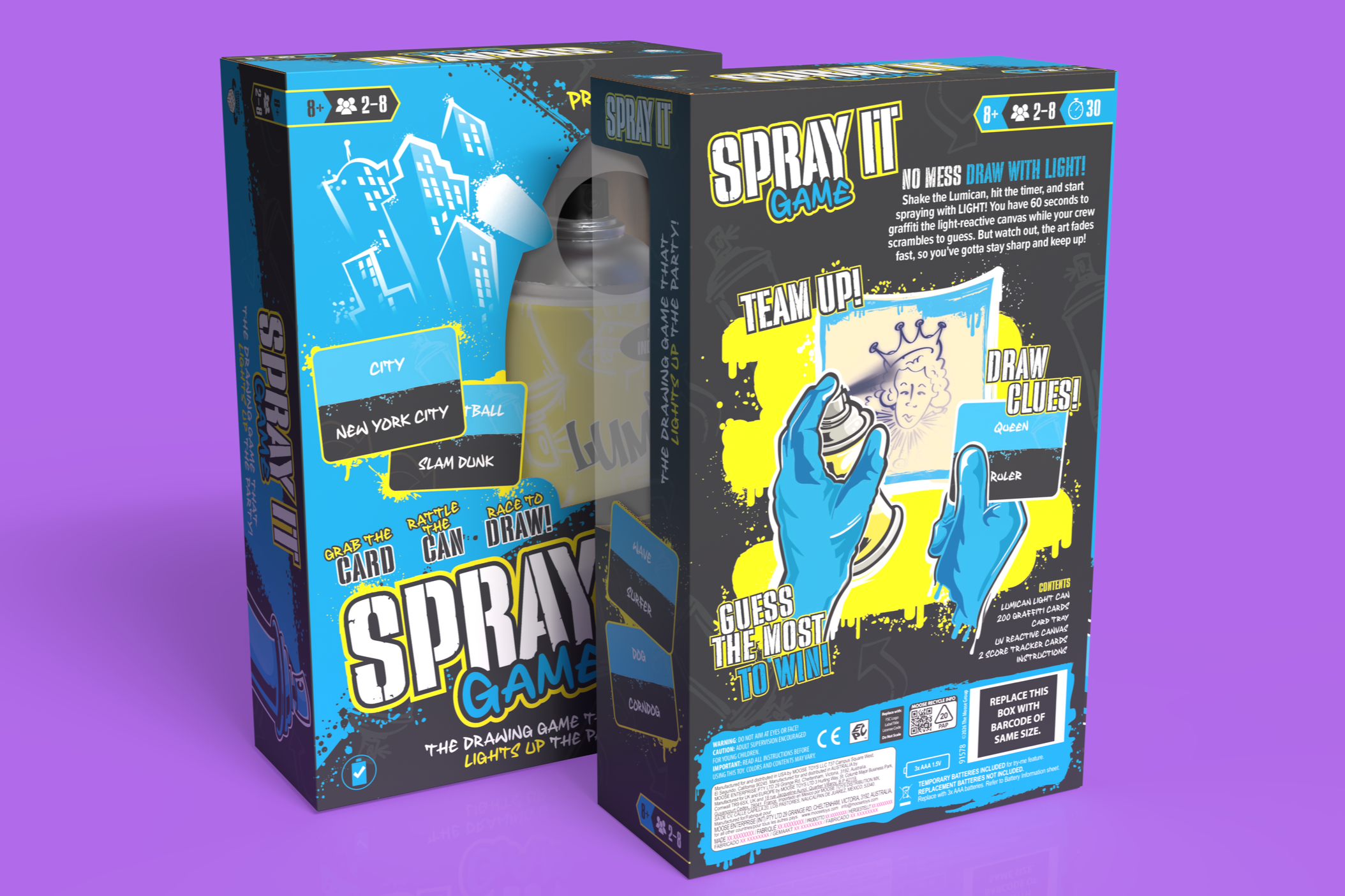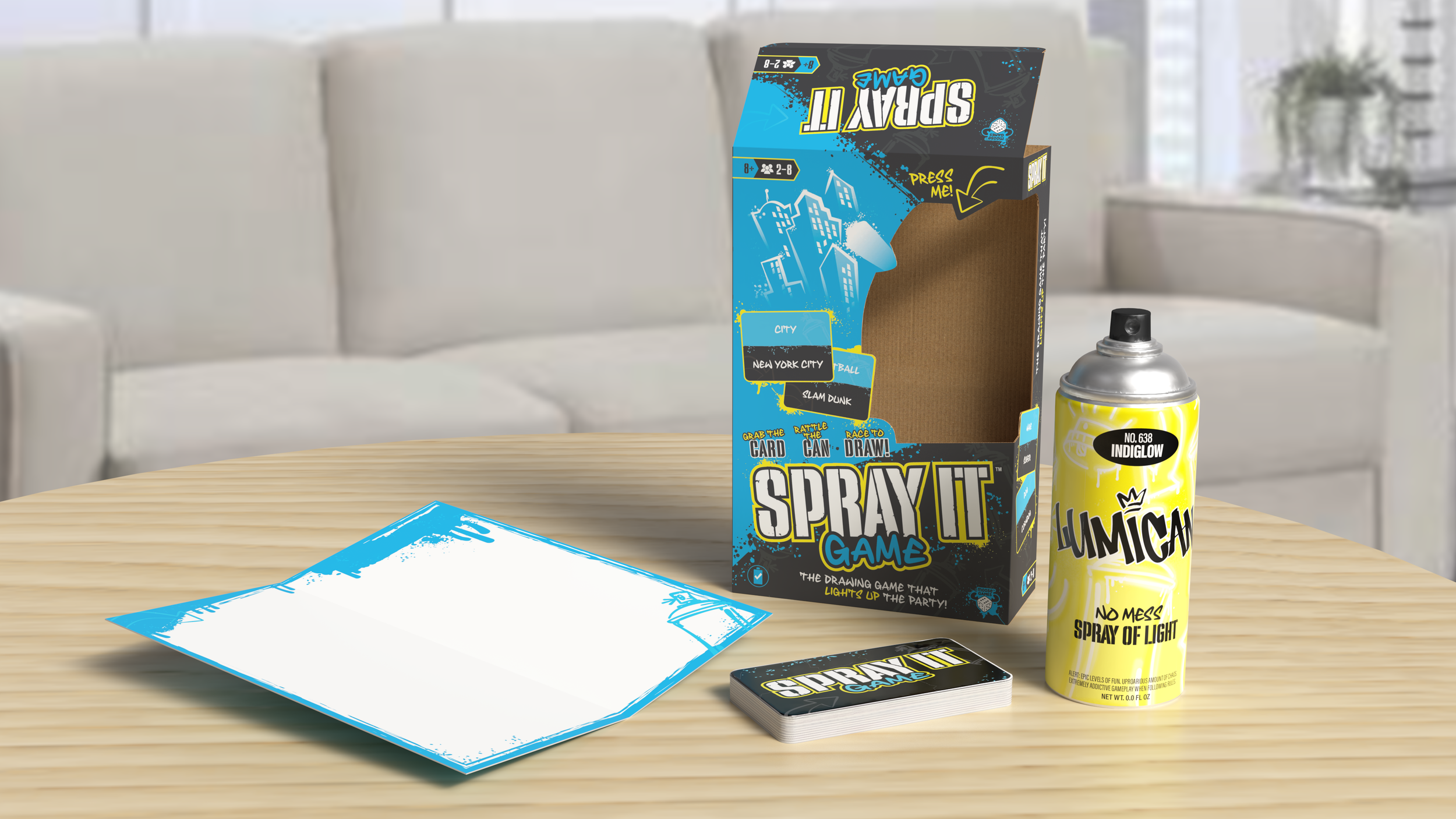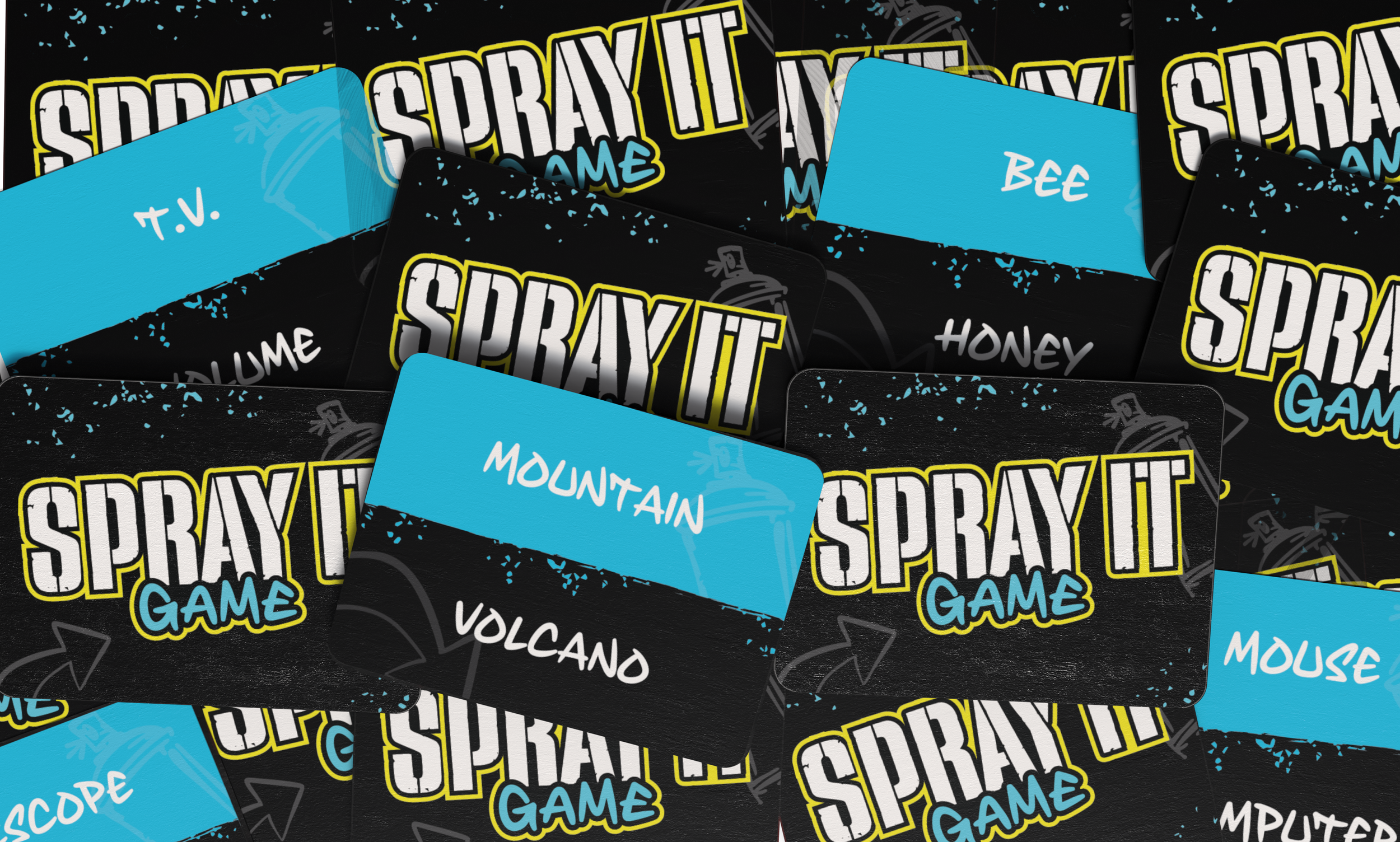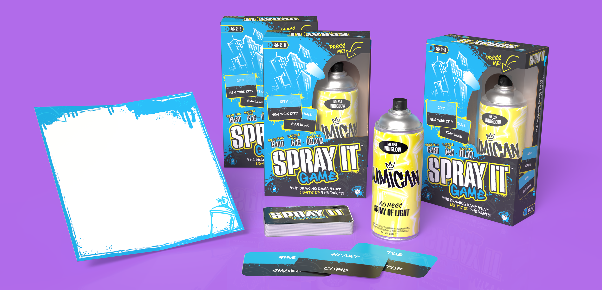
A drawing game that lights up the party! Spray It is an innovative twist on a drawing and guessing game and introduces a graffiti theme into the play. Draw a card, start the timer and use the UV light “spray paint” to graffiti the images onto the light reactive board. Draw fast - your spray paint images start to fade in seconds! Can your team guess before your masterpieces fade away?
At Moose Toys, I worked closely with the art director to develop a street art–inspired aesthetic with a limited color palette for this game. We balanced a clean visual approach with expressive street art elements such as paint splatter, loose doodles, and hand-drawn details.
PACKAGE DESIGN
ILLUSTRATION
STRUCTURE / DIELINE
LOGO CREATION
GAME COMPONENT DESIGN
INSTRUCTIONS LAYOUT / DESIGN
RESPONSIBILITIES
SPRAY IT GAME
2025
A drawing game that lights up the party! Spray It is an innovative twist on a drawing and guessing game and introduces a graffiti theme into the play. Draw a card, start the timer and use the UV light “spray paint” to graffiti the images onto the light reactive board. Draw fast - your spray paint images start to fade in seconds! Can your team guess before your masterpieces fade away?
At Moose Toys, I worked closely with the art director to develop a street art–inspired aesthetic with a limited color palette for this game. We balanced a clean visual approach with expressive street art elements such as paint splatter, loose doodles, and hand-drawn details.
SPRAY IT GAME
RESPONSIBILITIES
PACKAGE DESIGN
ILLUSTRATION
STRUCTURE / DIELINE
LOGO CREATION
GAME COMPONENT DESIGN
INSTRUCTIONS LAYOUT / DESIGN
DESIGNING AROUND THE THEME
The trickiest part in designing SPRAY IT was capturing the theme in a way that served the branding while not overpowering the product. One of the most appealing aspects of street art is how free, loose, and loud it is. We wanted to portray this while also making room for the games identity to clearly show through as well.
Because of the wide range of interpretations associated with this art style, the concept phase of the project required multiple rounds of mood boards and visual exploration. I was immediately inspired by a package structure featuring a two-sided window, which allowed us to prominently showcase the game’s central feature — the spray can. Once the team aligned on the visual direction and color palette, the rest of the identity came together quickly and cohesively.
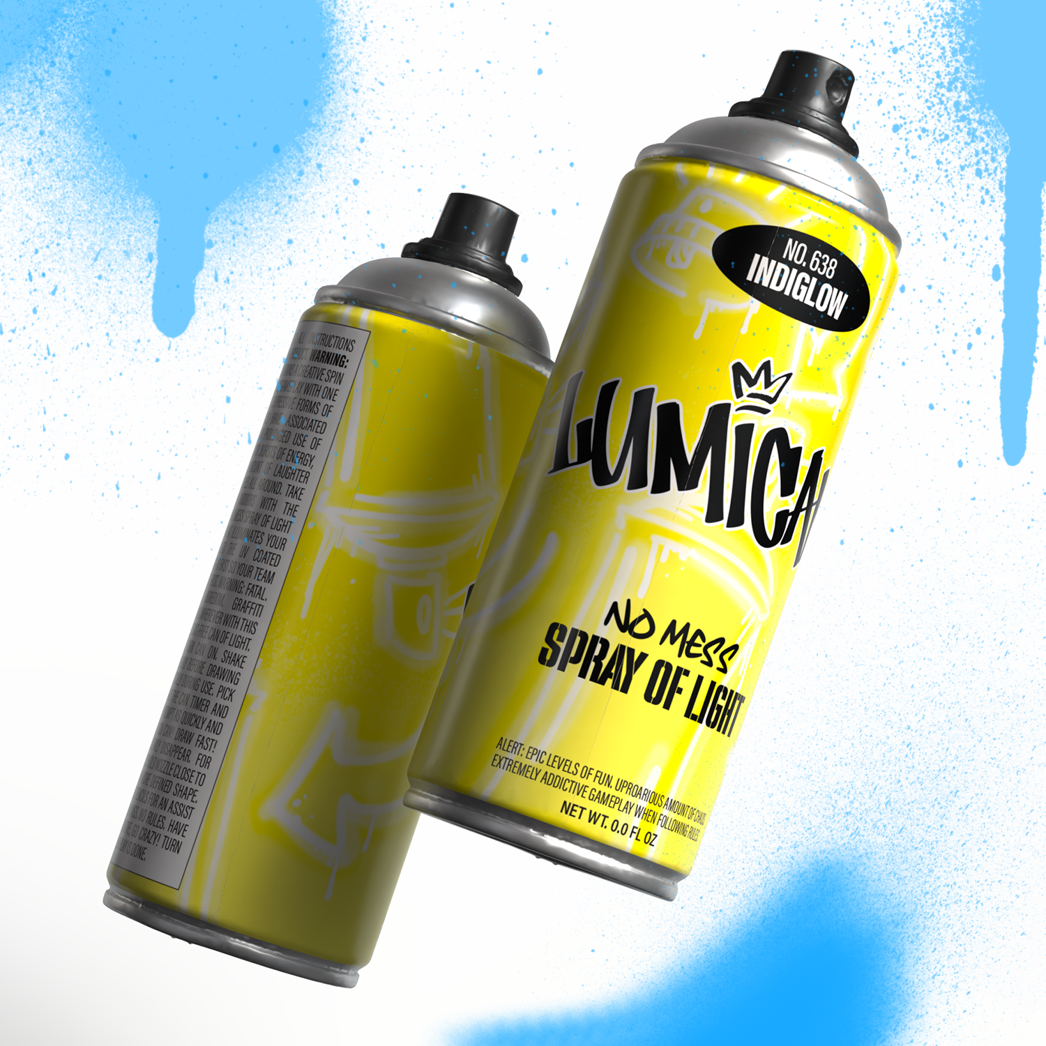
Despite any creative challenges involved in developing the visual identity for this game, two priorities remained central to my approach: creating a mock spray can that felt as authentic as possible, and supporting the branding with my own loose, graffiti-style illustrations. The final spray can design incorporated those illustrations alongside a lengthy parody warning label on the back and a playful paint color name that tied the concept together seamlessly.